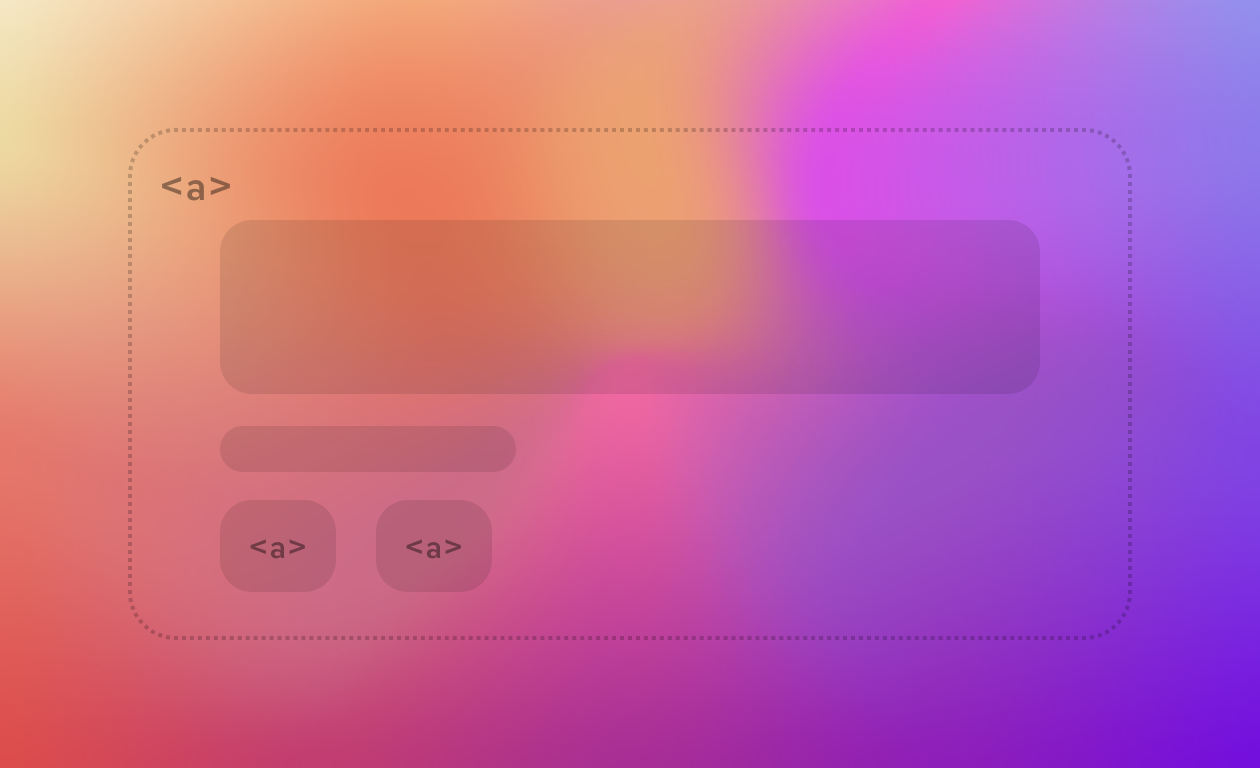
If you ever tried to nest <a> elements in HTML you could quickly notice that it doesn't always work as expected, since by convention (and a bit rules), you shouldn't nest this tag into each other.
There is however a different way to achieve the same behavior and still respect the standards.
Let's say we have a row.
<div class="card">
  <img src="thumbnail.jpg" alt="" />
  <h3><a href="/article/123">10 Things You Didn't Know About CSS</a></h3>
  <p>A quick look at some lesser-known tricks.</p>
  <a href="/author/jane-doe">Jane Doe</a>
</div>
The whole card should be clickable — that's the pattern users expect from cards, table rows, and list items all over the web. The naive instinct is to wrap the entire .card in an <a> tag. But then you hit a wall: you still want the author's name to link somewhere different, and nesting an <a> inside another <a> is invalid HTML. Browsers will "fix" it for you by closing the outer link early or flattening the structure, and the result is inconsistent, hard-to-debug click behavior.
The Stretched Link Technique
Instead of nesting, we make one link invisible and stretch it to cover the entire clickable area, while any other links inside stay exactly where they are — untouched, unnested, and fully functional.
.card {
  position: relative;
}

.card a.stretched-link::after {
  content: "";
  inset: 0;
  position: absolute;
}
<div class="card">
<img src="thumbnail.jpg" alt="" />
<h3><a href="/article/123" class="stretched-link">10 Things You Didn't Know About CSS</a></h3>
<p>A quick look at some lesser-known tricks.</p>
<a href="/author/jane-doe">Jane Doe</a>
</div>Here's what's happening:
.cardgetsposition: relative, turning it into the positioning context for anything absolutely positioned inside it.The primary link's
::afterpseudo-element is givenposition: absolutewithinset: 0(shorthand fortop: 0; right: 0; bottom: 0; left: 0), which stretches it to fill the entire.card— not just the link's own text.That pseudo-element is empty and invisible, but it's still a real clickable box, and clicking anywhere inside
.cardnow activates the article link.
No nesting, no invalid markup, no JavaScript.
Keeping other links clickable
If the stretched pseudo-element simply sat on top of everything, it would swallow every click, including the one meant for "Jane Doe." To fix that, any element that needs its own click target has to be lifted above the stretched layer with z-index, which only works if it also has a position value:
.card a:not(.stretched-link) {
  position: relative;
  z-index: 1;
}
This creates a small stacking order: the stretched link sits at the base of the card, and the author link floats just above it, intercepting clicks in its own bounding box before they reach the pseudo-element underneath.
Watch out for these gotchas
Positioning context. The stretched pseudo-element positions itself relative to the nearest positioned ancestor. If
.cardisn'tposition: relative(orabsolute/fixed), the pseudo-element will stretch to the next positioned ancestor up the tree (often the whole page) and the "clickable card" effect breaks in a confusing way.Overflow. If
.cardhasoverflow: hiddenfor rounded corners or similar, that's fine — the stretched link is still contained and clipped along with everything else.Text selection. Because the pseudo-element sits on top, dragging to select text inside the card can feel odd, since the mouse is technically dragging over a giant invisible link. This is a minor UX trade-off, not a bug. You could, of course, add a
position: relativeattribute to the text elements as well, but they would stop being clickable, thus breaking the entire point of this method.Accessibility. Screen reader users navigating by links will hear the primary link's accessible name, but the visual clickable area (the whole card) isn't inherently obvious from the accessibility tree alone. Make sure the link text is descriptive enough to stand on its own (avoid "Read more"), and consider
aria-labelledbyif the card's heading and the actual link text differ.Nested interactive elements beyond links. The same z-index trick applies to buttons, checkboxes, or any other interactive element inside the card — they all need
position: relative; z-index: 1;(or higher, if you're stacking multiple layers) to remain independently clickable.
Why this beats wrapping the whole card in <a>
Wrapping the entire card in a single <a> tag is the other common workaround, and it does avoid the nesting problem — but it comes with its own cost: every interactive element inside (buttons, secondary links, form controls) becomes invalid content inside an anchor, and browsers again handle that inconsistently. The stretched-link approach keeps every element exactly where the spec wants it, uses ordinary, well-supported CSS, and degrades gracefully — with the styles stripped away, you're left with a perfectly normal, perfectly valid card with two independent links.
It's a small technique, but it's one of those patterns that quietly shows up in nearly every card-based UI on the web once you know to look for it.